PROBLEM
How might we determine which skin products are safe for me and which are not?
SOLUTION
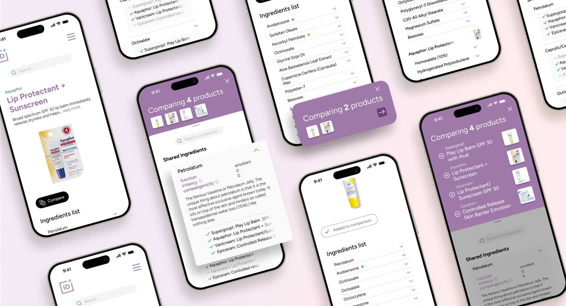
I created a multi-item comparison feature for mobile so that users could access plain-language product ingredient information for decision-making on the go.
ROLE
UX/UI Designer
Note: This project is not affiliated with INCIDecoder; this is a personal project for practice.
Background
INCIDecoder is an excellent free resource that makes information about skin product ingredients accessible. I recently experienced an eczema flare up after using some lip balm on a bike ride, and wanted to use INCIDecoder's wealth of easy-to-understand ingredient information to track down what was causing it. However, their current site limits comparisons to two products and arranges information awkwardly in the viewport.
This project tackled an interestingly complex challenge: presenting dense, text-heavy skincare ingredients in a way that feels digestible on a mobile screen. Comparing multiple products added another layer of difficulty—meaning the design had to balance just enough information with the flexibility for infinite comparisons, all within limited screen space. I didn't see any examples of this UX/UI challenge being solved yet, but it's a highly relevant scenario to many data-heavy industries like health tech.
I have a background in making complex, data-dense information intuitive and actionable. Skincare ingredients, with their long, technical names and nuanced classifications made this problem especially interesting. The goal was to create an experience where users could quickly scan, compare, and understand key differences—without feeling overwhelmed.

Problem Definition
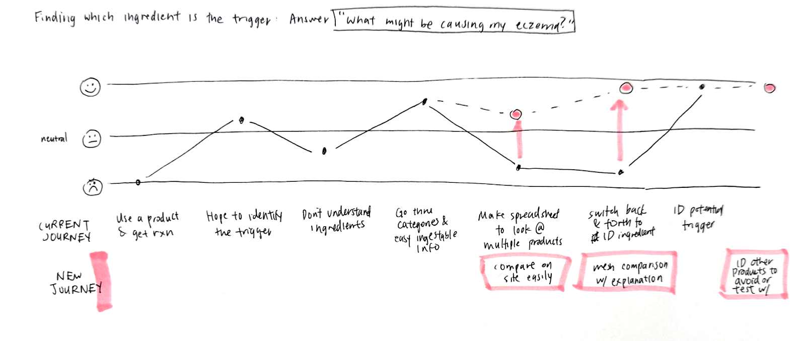
I mapped out a user journey from experiencing an outbreak due to a skincare product, to identifying the potential trigger using INCIDecoder.
I focused on the 2 areas where user frustration could be lessened:
Narrowing down the solution space, I set out to create functionality that would let a user, on the go, determine what might be causing a reaction and what products would be safe for them in the future.
Platform: Mobile
Skin reactions and flare-ups don't wait for you to be seated at the computer. Often, new products are sampled in store or borrowed while on-the-go when a user doesn't have their regular product with them. A mobile-first function would allow users to respond quickly.
Comparison amount: Infinite
When identifying the cause of a skin reaction, having more data is better—users benefit from comparing as many products as possible. To ensure the design remains flexible and scalable, it makes sense to support an unlimited number of product comparisons.
Design Explorations
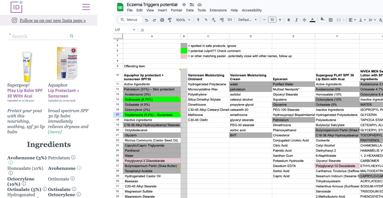
The existing 2-product comparison view, and my spreadsheet for comparing multiple products at a time.
The most commonly used tool for comparison is a table. The grid structure makes scanning across multiple products very easy, and people are very familiar with how to digest information in a table. However, tables are a challenge on mobile:
A matrix chart addresses some of these issues, but still requires theoretically infinite side scrolling for unlimited comparisons. However, I liked the idea of visual representations to reduce text-in-viewport, so I started thinking about data visualizations.
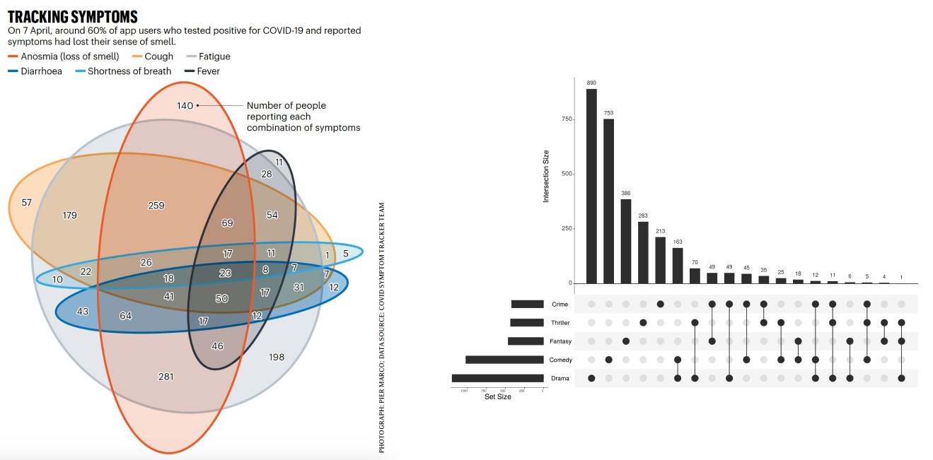
I considered using a visualization to reduce cognitive load and orient the user on the overlaps between different products.
Left: Venn diagrams become hard to parse after >4 items. Right: An UpSet data visualization is more effective at showing what is contained in each existing combination.
Initially, I thought this could be an effective way to give the user control in selecting exactly which overlap or exclusion they were interested in (e.g. "Show me which ingredients are unique in the product that triggered a reaction" or "Show me what's shared across all products I use").
However, I realized for the core problem of identifying safe skincare products, users typically don't care about partial overlaps (e.g., ingredients appearing in some but not all products). Instead, they focus on what's uniquely different or universally shared. That meant presenting a visualization creates more challenges than solutions:
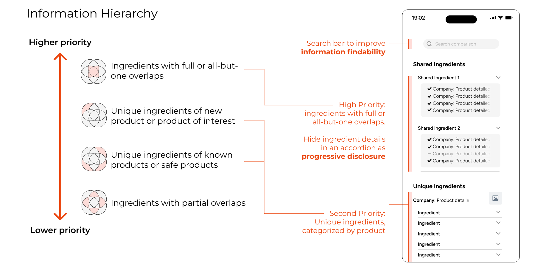
Thinking about the user's end goals helped me create an information hierarchy. That dictated how to allocate screen space, which led to my ultimate solution.
Results
Articulating the information hierarchy led me to my solution. I prioritized showing ingredients, and used a card-like layout to show which products shared the listed ingredient.
Ingredients were placed in an accordion that expanded into a card with more details about each ingredient. I also added a backdrop that showed thumbnails of the products being compared. The backdrop slides down to reveal the product details, and gives the user an option to edit the comparison.
Shared ingredients show information as a card; further details hidden until expanded. Ingredients organized in order of priority in information hierarchy.
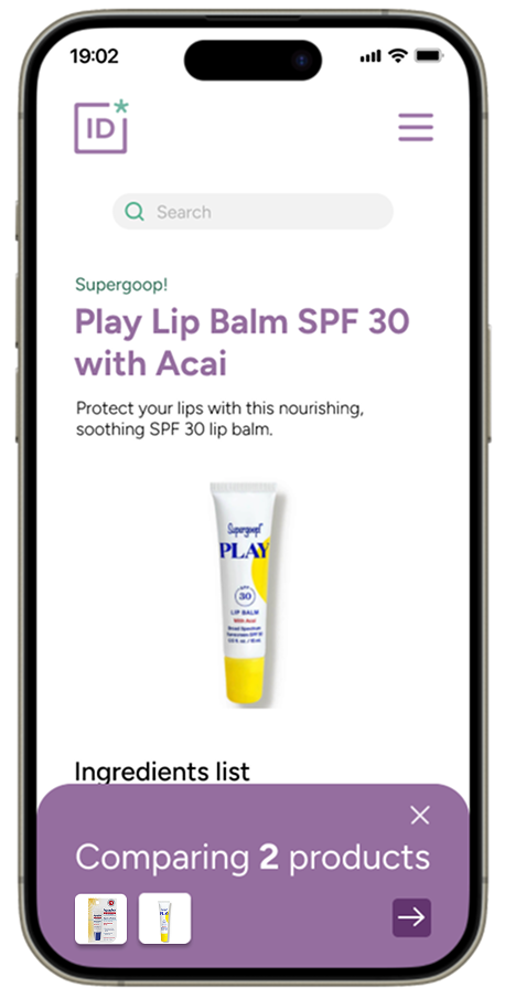
Products included in the comparison are visible as thumbnails. The backdrop expands into an editable detailed view when dragged down.
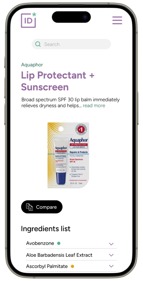
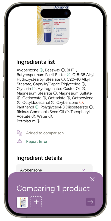
A flow for adding products to the comparison tray. Previously, there was no indication for what had been already selected for comparison.
Reflections
This was a very interesting technical challenge! I haven't seen many great solutions for displaying detailed data on mobile. I suspect it's because most data-heavy platforms assume users are on desktop. But with younger generations leaning mobile-first—even for tasks like data wrangling and multi-page forms—we're likely to see more products adapt, bringing high-density data to mobile in smarter ways.
Working on this project made me consider several things:
I hope to work with the folks at INCIDecoder to implement this onto their site!